In days passed computers were limited in which fonts could be used. Do you remember the Commodore computer? The word processor simply had one family of fonts. If you wanted to create a header with a unique font you would have to physically cut and paste the paper together. These times might have limited the use of varying fonts, but at least people did not have the same problems they have these days. While dot matrix printers spewed out monotonous text that did not please the eye, there were different issues with matching aesthetic features as there are today. Matching fonts together can prove to be difficult. If you do not get it right your design might look bad.
The best way to learn how to match font types together is to check out good examples. There are different websites, which offer combinations of fonts that you can use. Whether you want to find some ideas, or simply use what you see, you can find some great examples. This article will give you a crash course in font matching and send you in the right direction, but you should do your own research if you truly want to master font matching.
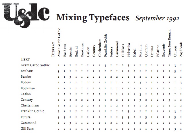
Take a look at Douglas Bonneville’s 19 top fonts in 19 top combinations. This is a cheat sheet which shows 19 of the most popular web fonts as headers, and couples them with good body text choices. The sheet even has the pairs shown together, so all you need to do is peruse the list and select a combination that you like. This is a great way to choose the right fonts with some guidance.
If you would like an alternative, check out arrayed infographic codifying 22 possible type combinations. There is not a visual key with this one, but it does give you a lot of suggestions for possible pairings. Now you do not have to select your fonts without some helpful guidance. If you are interested in finding similar cheat sheets it would be a good idea to do a search on Google. Take a look at popular websites and see what types of fonts they have combines to get some ideas.
Making well balanced contrast pairs
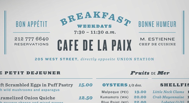
Now that you have your sheets of possible pairings, it is to look at a method for choosing your own. Many cheat sheets use contrast as a theme. For example, you can couple serif fonts with sans-serif, which can be done the other way around. The main idea is to find fonts which have small similarities, so that they will go well together while still contrasting.
More reading
Four ways to mix fonts by Hoefler and Frere-Jones list a large amount of font combinations and ideas for using them. The pairings in this article are used as guidelines, rather than listing hard and fast rules for you to follow. Something these designers teach is to find one thing that should stay the same between the fonts, and find something else that will vary.
No related posts.
Related posts brought to you by Yet Another Related Posts Plugin.


Leave Your Response