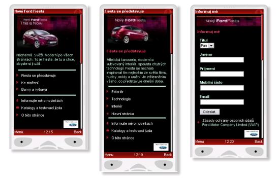
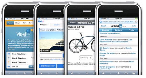
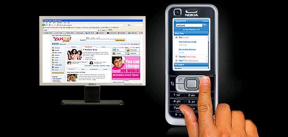
Nowadays mobile devices for the Internet are actually surpassing the PC and laptop usage, as more and more users are connecting to the web with their mobile browsers. The increase of these mobile devices has made the demand for highly effective mobile websites skyrocket. This is why there is an increasing demand by website owners to have their site developed in order to benefit these mobile users.
These new web developments are the future for enhanced Internet platforms, and will soon become a necessity when developing a website for clients. Designing websites for mobile devices is no easy feat. However, there are some simple and effective elements you can use and add to your web development plan that will render websites more attractive when viewed on mobile devices.
The markup languages available when designing websites offer a selection of applications you can use. The most popular markup language used at the beginning of the mobile device concept was wireless Markup Language or VML. This was the only means available for browsing on the web by using the Wireless Application Protocol websites.
Now XHTML has stepped in as an innovative solution for mobile device applications. Most of the mobile produced nowadays support XHTML and XHTMLP-MP, the latter making it easier for mobile phones and devices to view a web document on their screens.
Minimalist designs are also being developed to get rid of all the clutter that can be found in websites, which makes viewing difficult on mobile devices. You will find that many features that you are using on your website are incompatible with mobile devices, thus will not be viewed the same way they are on classic computers. This is why web designing nowadays should stick to minimalist designs if it wants to have a wider public on the Internet.
Using simple features and elements for developing a website will enhance the usability of the website. Limit the website to a few basic functions, if you want those viewing the web pages from a mobile device to reap the best benefits as users.
When designing and developing a website you really have to consider who is likely to view the website, and from their design the pages according to your type of audience, as this will really make a difference to the website. Knowing your audience will allow you to develop those applications that are more likely to interest the website users.
It is important that users can have direct access to the various items on the website and view the content immediately, avoid having them log-in each time or having them click on numerous items before they can read what is of interest to them.
Designing websites for mobile devices is not easy. However, it is by no means impossible. Although companies producing mobile devices do not consider usability, this should not make browsing on the web difficult for mobile device users; this is why it is important to make your design simple.
No related posts.
Related posts brought to you by Yet Another Related Posts Plugin.


Leave Your Response