Having a good web form is very important for all websites and applications these days. Unless you have some way for your visitors to interact with you, via a form, you are simply displaying information for them. This can be somewhat one sided, and people will not be able to get their own information across. People spend a great deal of time trying to get visitors to use their forms, whether they are for sign up or contact details. It is surprising that only few people spend enough time actually perfecting those forms before making them public.
There are many ways to get inspiration for the techniques required to turn your dull forms into works of art. This article will discuss some key examples of forms, which work well.
Quirkiness
A big part of designing for the web is putting some personal touches into the design, so that people can relate to it. It is a good idea to make your designs in some way quirky or fun, so that people will enjoy them more. Using some friendliness will make your input methods seem more human, and people will appreciate that.
Red Tiki
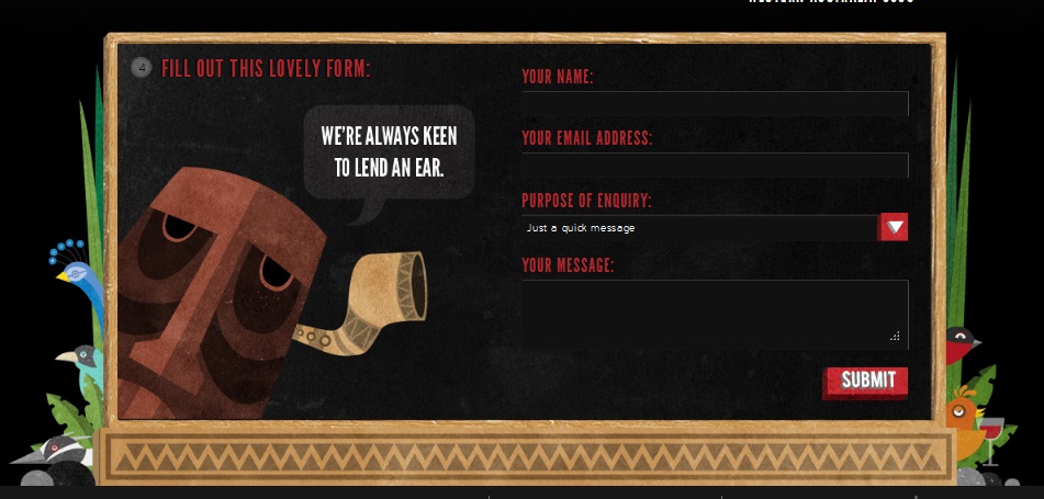
Red Tiki uses a good deal of fun and quirkiness is all of their branding, so it is no wonder that their form continues this trend. They make it fun and approachable, with touches like adding an illustrated frame and having a small wood character looking out at the user. Using fun phrases such as “we’re always keen to lend an ear,” and “this lovely form” add some fun to the user’s experience. If you take a look at this form, you will see that it is full of personality, fun and flare. This will encourage users to continue filling out the form, until it is complete and hit the submit button.
Jarad Johnson
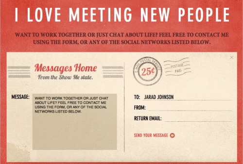
The contact form of Jarad Johnson has design elements, which are similar to a post card. This helps it to stand out from other, more generic, forms. They have even gone so far as to include the postage section as already paid, since it is free to submit the form. Adding small touches like this helps to create a good sense of communication with your visitors.
Sophie Hardach
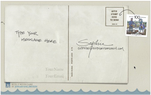
Sophie Hardach has created a great example of a fun form, with a post card design used for the contact form. In order to send the form the stamp logo has to be dragged into the appropriate area, which creates more user interaction.
Applicom
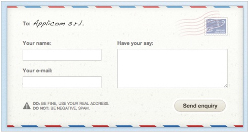
This form of Applicom is a good example of how you can be neat and professional without being boring. The form is designed to look like a traditional letter. There is a paper texture, which has been used, as well as a stamp design. The name of the addressee is even hand written, adding a touch of style. This form has a good level of personality, which is refreshing to the user.
No related posts.
Related posts brought to you by Yet Another Related Posts Plugin.


Leave Your Response