If you have been on the internet in the past 10 years, you have inevitably heard of Google. Relative newcomer to the search engine game is Bing. Both of these sites offer a way to search the internet for information that you need.
When using a search engine, results are likely what lead us back to using the same one over and over again. However, have you ever stopped to think about the usability of these top search engines web pages? Chances are you have not.
There are hundreds of millions of people that use Bing and Google every single day. Think about how much time can be saved if the sites took the time to tweak a few of the usability options. These little changes can lead to higher satisfaction and a better experience with the site overall.
The test that is outlined below will take into account how both Bing and Google stack up against each other when it comes to usability. You can then take this information and use it for your own web page. Learn how you can create a better-designed page that is easy for your customers to use.
The Test
This test is designed to be fair, with half of the people being directed to Bing’s home page screen shots and the other half going to Google. The test consists of seven questions that are simple and easy to answer.
Each person that takes the test will be shown a homepage of one of the search engine giants. They will read the question and click on the area in which they think they can find this information. The site will keep track of the time it takes you to answer the question and will generate a heat map of where everyone who takes the test clicks. These results will reflect the time it takes users to navigate the site to find the information they are looking for.
Processing the Data
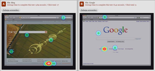
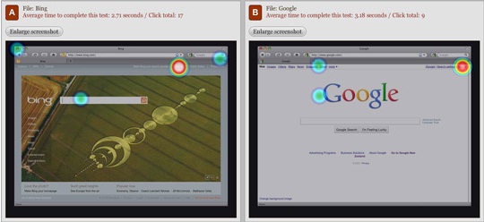
The questions that are asked are simple, yet give important information about the site and how easy it is to navigate. You can view the results at http://video.intuitionhq.com/pub/405.
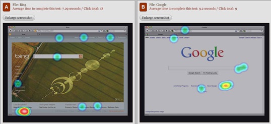
1. Where do you click to search for a topic?
For the first question, Google users were faster, but they often did not click in the right place. For this reason, the point goes to Bing.
2. Click on the area you would use to view maps
The second question results in a virtual tie.
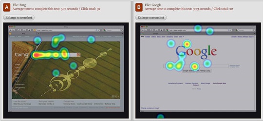
3. How do you navigate to the New Zealand site?
The third question goes to Bing, with the speed of the users on their site beating Google users by two seconds.
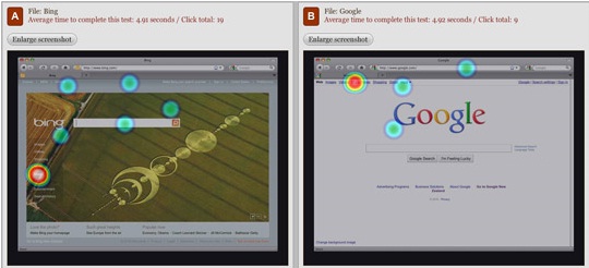
4. If you have an email account with this provider, how do you access it?
The fourth question is a definite win for Google, with the users almost four seconds faster.
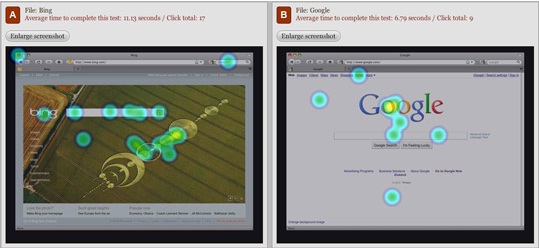
5. What part of the screen attracts your attention the most?
When it comes to the page design, most of the people on Google’s page said the word Google was the most attractive and on Bing, many people chose the crop circles.
6. Where would you click to learn about advertising with this provider?
If you are looking to get your brand out there, Google is the clear winner.
7. How do you sign in on this site?
Signing in on both pages ends up in a tie that is to close to call.
Overall, Google is slightly better than Bing is, but not much. This is rather surprising considering that Google has been around for much longer. While both sites can use some minor tweaking, they are both very streamlined and user friendly.
No related posts.
Related posts brought to you by Yet Another Related Posts Plugin.





Leave Your Response