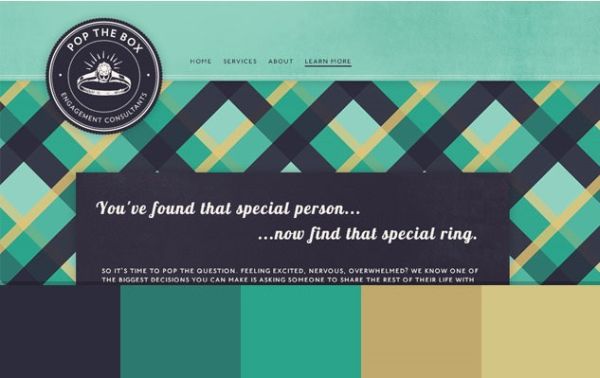
In web design, color is the most compelling element of a web page. Placement, layout, density, and choice of color palette, can decide the fate of the website. Working the colors into the design successfully, to make the website spectacular, involves a lot of trial and error. For your next project, think of usage of colors in a new light.
The process of deciding color schemes and placement, especially, with all the colors that are available, is a learned skill. Not only do they have to work well together, they must work within the design. You have to consider that there are more than one palette combinations that work well together. Color sets the atmosphere for the website and must be pleasing to the eye.
Depending on the content of the website, consider the age appropriateness of the color schemes. Teenagers and seniors will have an entirely different reaction to the color palettes used. Since color creates an atmosphere for the viewer, you don’t want to alienate the intended market audience.
The group of colors that make up the color scheme creates a mood for the website. Different colors create different effects. You can create designs that bring out different emotions such as happy, welcoming, contemporary, casual, and formal.
As with most things, consistency provides a cohesive look. You need to be consistent throughout the entire design. This gives the reader an easy navigational flow. The human brain seeks out patterns to unify what it is seeing. If this is not accomplished, without much effort, the tendency for most is to give up and move on.
Some colors are more pleasing to the eye than others, meaning that not all colors are created equal. Deciding what colors mesh together, which combinations complement each other the best, and choice of colors to use within the layout takes patience. Darker colors create bolder statements than lighter ones. The background outlines the character of the website.
The background lays the ground work for the entire web design. The color choice needs to blend in with the typography, images and branding colors. There are different effects that can be created. For example, you can use a solid color or gradient. The use of the latter requires caution.
Images, if designed appropriately, can create an astonishing atmosphere. An over-sized background image can create the stunning visual effect, if placed properly, and can breathe life into the design. An image speaks volumes and can eliminate the usage of text to get the website idea across.
There is always the option of using software to assist you with your quest for the perfect color scheme choice. There are many free online tools. Some of these programs will also demonstrate variations between light and dark. You can also learn exactly what colors harmonize each other. Some have the ability to provide examples of different schemes like Analogous, Monochromatic, and Complementary.
After choosing colors and how they work together, you have to see how they work within the actual design. Does the color scheme work with the branding? Looking at color choice in a new light opens the doors to new inspirations.
No related posts.
Related posts brought to you by Yet Another Related Posts Plugin.


Leave Your Response