Have you ever stopped to consider just how important the input form is on a Website? Most web designers probably underestimate this fundamental element, when in fact it is the focal point and the most essential issue for all Websites or any other application nowadays. The input form is the centerpiece of all interaction and often is the reason why a Website is not being successful.
If not enough time and effort is spent to bring this application up to standards and beyond, we cannot expect users to be induced to sign up and fill out these contact forms in our Website. It is essential that web designers spend more time in crafting and finding methods that will attract users to fill in these areas, by rendering them as user-friendly and attractive as possible.
There are quite a few techniques that can be used to turn these contact forms in to a successful means of communication, thus avoiding a complete flop for the Website. The following are some useful tips that can help avoid failure as far as Web from designing is concerned.
Originality is the Key to Success

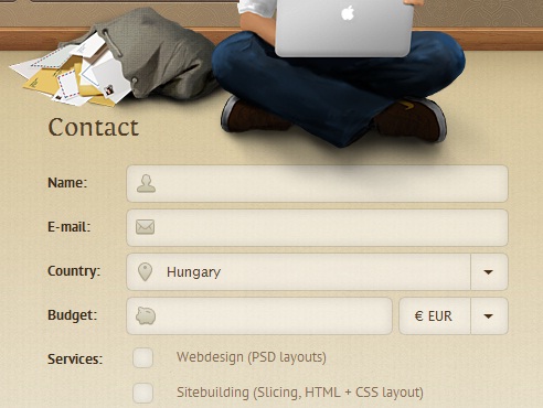
One of the essential elements in web designing is to be able to make a personality statement and stand out from the crowd. It is also important to establish a “real” relationship with users, as people enjoy communicating with other people. A contact form that has an original touch and can impart a friendly mood will help users in the input process and make them feel they are actually having fun by doing so. Imagine that your contact form is actually an exchange between two people and you will find your ideal Web form.
The Submit button is the ultimate goal

You need to carry the users through the Web form effectively and lead them to the finish line, in order to complete the registration process. This is why the finish line is important and can come under various forms, be it an order confirmation button, signup tab or a submit button. The aim a web designer should have in mind when creating this Web form, is that users need to arrive to this point of conversion, under the form of a button or similar element, and be satisfied with the process.

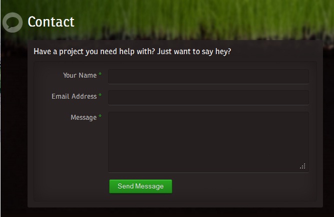
The submitting form should be clearly visible and easy to understand, including the use of straightforward language which will help users get through the signing up process quickly.
You may consider using the form of item selecting instead of having users fill in the form themselves, this is easier and avoids stalling the reader during the process. Empty fields can, at times confuse the reader; this is why a choice of answers is a better method when creating Web forms.

Whatever method you choose, keep in mind how important Web forms actually are when you are creating your next Website, and try to dedicate more time in the creation of attractive, direct and friendlier forms that will lead to higher conversion rates.
No related posts.
Related posts brought to you by Yet Another Related Posts Plugin.


Leave Your Response