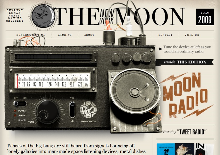
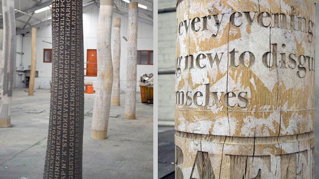
Typography plays a major role in keeping websites dynamic and contributes in making a website’s content available worldwide. However, many web designers do not consider this facet that important and consequently, do not keep up with the new technology trends that deal with this feature.
Although there have been no revolutionary ideas in typography, innovative techniques are been shared among the web designing milieu.
The first issues one should consider when styling text, is how readers will view these. A text will need to be well-divided into paragraphs as well as a few headings and the links within the text should be designed to fit in with the content. CCS properties can be used to design tags in web documents in a very precise way, allowing readers to view websites in particular forms and styles.
The modern outlook towards the typography used in paragraphs is the ease with which readers can follow the text, although many web designers still use small font to make web sites more stylish.
Headings have to stand out from the main text and be as direct and informative as possible, so readers can follow the various headings in the text and understand what the content is about at a first glance. The best way to attract the readers’ attention is by creating headings in different fonts and styles than paragraphs.
Line height is another important aspect of typography designing. The space between the lines within the text can be set in the CSS and added height between lines can considerably change the way the content on the website stands out. Added height between lines makes browsing content easier and is more user-friendly.
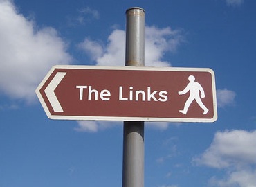
Links need to stand out on a website, as they are the essential elements that allow users to browse through the various pages and options of the web site. The style should be considered for both the default links within the paragraphs as well as those in the header, footer and sidebar that allow users to browse through the web site. The links within the main content and paragraphs should stand out from the rest of the text, so readers know they are actual links.
When styling and choosing the size of typography there are some issues such as how the text will appear on certain browsers and mobile devices. Content may be displayed oddly if the font is not scaled equally. Font sizes should be set to 62.5%, which sets the text for em units that are fonts used on the web. This will allow readers to choose the size of the page without distorting the text.
Modern web designing needs to focus strongly on the various typographical aspects of web sites, for they are probably one of the most important issues when considering how successful a website will be. Typography should be a focal point for all modern web site design and many resources can be found to help web designers keep in touch with this evolving aspect of web design.
No related posts.
Related posts brought to you by Yet Another Related Posts Plugin.


Leave Your Response