The urge to jump right in and begin designing is often the automatic response when a project arises to design a website. However, the planning stage of the design is an essential element that opens the doors to the process of creation. Below are some ideas to use in planning a perfect website.
The First Step
The initial stage starts when the designer feels the most antsy and driven. When the design is empty, your brain gets overloaded with thoughts and concepts. This is the time to take a few deep breathes while considering the ideals of the project.
What is the expected outcome of the project? Are there any specific elements that are to be included? Be sure to write a list of these elements. Try drawing some prototypes before opening Photoshop. If you are not gifted artistically, a crude drawing may give you inspiration, if nothing else. The purpose of the prototype is that it becomes a wire frame that you can use as a base for all pages and as well as a guideline. The wire frame will probably change for each style of page.
Compose More Than One Design
After you have completed a strong prototype, you should consider composing a couple of additional one, to compare to your original. This step is a time saver for the ending stages, if you are one of those people that constantly second guess yourself. Having more than one guide to compare will drive you to choose a product for the final stages. You can do this in Photoshop if you are not comfortable with drawing them by hand.
Analyze Design Galleries

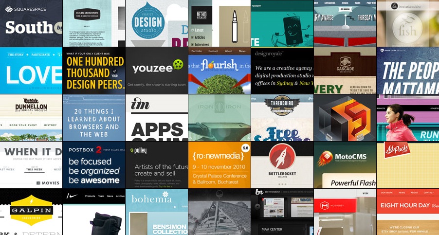
You may find inspiration from viewing galleries and analyzing designs created by other designers. Some people do not agree with this tactic. They feel that these galleries do not provide any value and are only a means of copying other designers, this train of thought is understandable, but there is an opposite opinion. The galleries are full of designs submitted by web designers that chose to place their creations there. They probably are honored if others use their work as inspiration. Besides, you are only getting ideas and blending them with your own ideas. There is nothing wrong with that.
View Design from Users Point of View
Begin this process with a clear head. If you have been working on the design, take a break. Before you begin coding, visualize that you are the user browsing through the design. Pretend for a moment that this is your first time seeing it. How would you navigate your way through it?
During the visualization process, you might see changes that are required. You will see the whole picture, rather than just your side.
White Space

A crucial part of any design is the white space. Page elements that are properly laid out provide a symmetry that is natural in web design. Similar to white space, elements that take up space that is not needed must be removed. The contents of the page must have room and allow visitors to interact freely with them.
No related posts.
Related posts brought to you by Yet Another Related Posts Plugin.


Leave Your Response