If you want to make a website that catches the eye, is well balanced, and really says something to your visitors, you have to focus on the core elements of web design. These are fundamentals, which you can use when you come across a difficult part of your project. If you make yourself familiar with these techniques, you will have all the knowledge that you need to make the right decisions while creating your designs.
Lines
The most basic element that we use in the web design is a simple line. Lines have width and length, but they lack depth. Choosing the right types of lines in your design helps to convey moods and feelings. You might think that every line looks the same, but there are subtle differences, which you should be aware of while working. Lines are great for organizing your work. You can use them to split up sections of your website, and group related materials together. Lines are used as frames for images, to join articles, and to separate menus.
Grids
If you want to position different page elements neatly, you might consider the use of a grid. Generally, the grid is actually invisible, but you can use lines to add more structure.
When you are using lines, try to choose ones that properly get across your message. You can select thin, thick, dotted, wavy or hand drawn style lines.
Think about why you are using a line. Do you want to join two parts of your site together, so that people can see they are related? Perhaps you want to use a line to separate different elements of your site. Maybe you are using a line as a border or a frame for an image. When using grids, you are basically trying to organize your information in a neat and clear way.
Forms
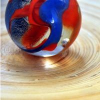
When you are using a 3D object, like a cube or a sphere, you are using a form. They are often used in fully 3D designs, naturally. However, they are commonly used with print or web design. If a website is using techniques, which are 3D, they are using forms.
Shapes
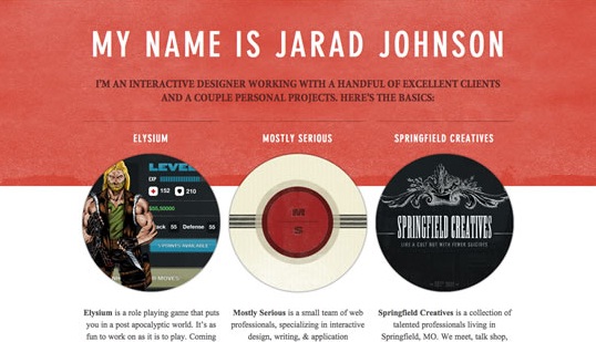
If you are using ordinary 2D elements, where a line forms a border around a certain area, you are using a shape. This includes things like circles, rectangles and triangles. You can vary shapes in a lot of different ways, and use them to direct the user’s eyes to certain parts of the screen.
Textures
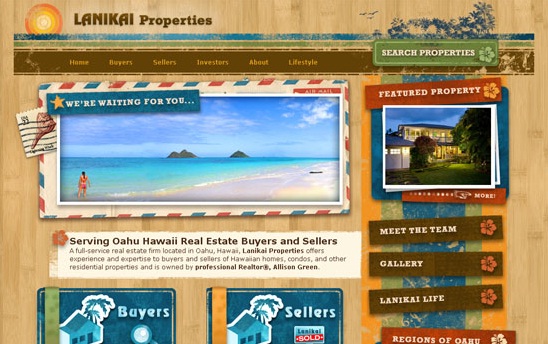
Correctly using texture is a good way to create a certain mood for your design. Textures include things like stone, wood, fabric, paper and concrete. You can create a feeling of texture in the way that you use background images on your site. Remember not to use textures just for the sake of using them. You can add texture through the use of images, such as illustrations or photographs, and not just by using backgrounds. Try to create a sense of contrast with the textures that you select.
No related posts.
Related posts brought to you by Yet Another Related Posts Plugin.





Leave Your Response