Any webpage is made up of a series of components, and they should all work together to accomplish the same goal – making a successful page that builds a community or sells a product to the user. Each part has to compliment the other parts in order to create a fun, interactive, and usable experience for visitors. If you cannot effectively do this, you will be unlikely to have a successful webpage. Failure in this can result in the loss of sales, and you will have yourself an unsuccessful webpage design. The following article will address the different areas that are crucial in creating a good webpage.
Layout
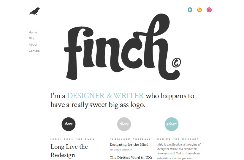
In order to make a good webpage, you have to have a solid layout. You should begin by making mock up wire frames of your site, and this will be a good starting point when it is time to flesh things out. Remember that you should use white space effectively. No one wants to visit a site that is too busy, and filled with graphics, animations and videos. In the world of design, less is often more, and this is an important rule to remember when you are designing a website.
 Finch: an example of effective use of white space.
Visited links
When someone visits a link, that link should change color. If someone is going to come back to your site, and we hope that they do, they will need to remember which links they have already visited. If you fail to include this simple effect, you might find that people cannot remember where they have already been, and might leave your site in frustration.
Your color schemes should be applicable to your targeted audience. If you use too many colors, things can seem to be a bit random, and your site might look ugly. It is a good idea to choose a simple scheme of around three colors to work with when making your site. Make sure that they complement each other and work to create a pleasant outcome.
Usability
If a site is going to work well for a visitor, it has to be highly functional. Remember that a good site should be easy to navigate, and should not confuse the user. If you do not make your site functional, you are likely to lose visitors.
Typography
Add a variety of color, size and different weights to your fonts. Do not go overboard, as no one wants to read a random display of various fonts when trying to gain information. Keep things simple and elegant, and you should be on the right track. Keep your letter, line and word spacing the same for your entire page, otherwise your site might look amateurish. The height of your lines should be 1.5 times that of your font sizes.
Design
Every aspect of your design should help to increase the overall mood of your site. Do not add anything that detracts from this, and you should end up with a nice looking site. Make sure that you are consistent with your use of different elements, so that you can create an effective theme throughout your pages. Giving attention to small details is important, as even the smallest thing gone wrong can spell disaster. Keep this important rule in mind when you are designing: less is more. Do not fill your page with too much, even if you think it looks cool.
No related posts.
Related posts brought to you by Yet Another Related Posts Plugin.


Leave Your Response