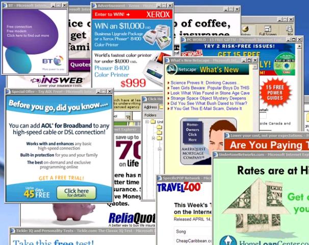
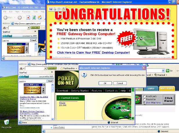
There are new tools coming up in web design continuously. Some become success over-night, some take time and some flop anyway. Modal window is a new design element replacing the pop up window.
But they are not one and the same.
We all are familiar with those annoying pop up windows. They are mostly spam, tricks used by advertisers to go through ads, they are literally forced on us, steal away out time and attention and hence are a pain-in-the-neck. Everybody hates them. No doubt every Internet browser maker is putting more efforts in making their pop up blockers more and more effective and user efficient with everyday.
A fancy version of pop up ads can be called the Modal windows. First of all, they are not spam, not unnecessary and if carefully incorporated; not annoying either. They actually have a well-defined purpose. The only similarity between Modal windows and pop ups is that they both are small windows that pop up from the main window.
While pop ups are useless because they throw irrelevant, absurd, crude ads on us; modal windows at least aim to provide us with the relevant information. But most of the times, we don’t want extra information.
Mostly Modal Windows are used for the following. They are either require for signing up, or entering user information such as e-mail id, name etc., or for displaying emergency or error messages. This way the website can store users information and hence send advertising/marketing messages, RSS feeds of blogs or alerts when new articles are posted. Modal windows find best use in displaying products in greater detail, closer view, different views etc. They are very commonly seen in websites of consumer brands.
Web designers need to have knowledge of Java script, CSS, XHTML, AJAX to incorporate this tool into their web pages.
But sometimes, a modal box could defeat its own purpose; that is they might drive away first time users instead of bringing back the old users. This happens because users have very little attention span and if a particular site requires entering information to reach a particular destination, impatient users might just skip the page. This can be avoided by having as little data fields as possible. Do away with a single text field say email wherever necessary.
But still many users prefer reading the content first without having to enter their name or email. And most of us don’t want to subscribe to the website for receiving more information from them. We just want to read what we want and we may never come back because we simply may never need to know more.
Also, some spammers have begun to use this tool increasingly to cleverly impose unwanted ads on users.
Incorporate Modal box in your design only after careful consideration because for some people they are as annoying as pop-ups. Any tool, no matter how good must never be over used. Use only where truly necessary and remember to keep it easy and appealing for users.
No related posts.
Related posts brought to you by Yet Another Related Posts Plugin.


Leave Your Response