Although we can find many techniques and tips that can help us improve the usability of our websites from a great number of resources on and off the web, there is no better advice than techniques which have actually been proven to be effective. If you have the back up of data and reports that prove the tips and theories then you can be sure these will work.
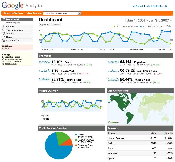
Eye tracking studies, analytics, reports and surveys on usability that concern how user-friendly a website really is are the sort of data we should rely on that will give us the best usability techniques.
One misconception most website developers have on causing frustration and impatience when users need to click more than three times to find the information they have come to look for, is not actually proven.
Although it may make sense if you look at the issue logically, there is not data to sustain the three click rule. It has indeed been proven that the users do not become frustrated due to the number of clicks they have to actuate, but for other reasons. A study was conducted which gave results stating that people did not give up after just three clicks, but actually went on for another 10.
This means that you should not be focusing on this rule, but more on the ease of use when doing so. It is essential to create an interface that is simple and attractive to use, even though it make take more than three clicks to get anywhere.
Make sure you allow for content scanning with the F-shaped pattern technique. Here another research has proven that when people scan content they use an F-shaped pattern when reading. These studies are based on eye tracking tests that identify the way people scan and read content on the web.
Another study carried out by companies who work on search marketing that have been working with eye tracking research methods with other firms including Eyetools, have discovered a pattern which is similar to the former. This was found when they were testing the search engine results presented by Google using an eye tracking survey, which counted fifty participants. This area of the Google page is called the Google Golden Triangle, as this is where most of the eye concentration goes, on the top and left of the page. These results are consistent with the F-shaped patterns that were noticed in other similar researches.
This is important information for both web designers and content providers as they provide useful and concrete data implying that important elements and content should be placed on the left, and that this content should also be formatted in the F-shaped pattern. This includes the headings that are then followed by bullet points or other paragraphs.
If you layout content and elements on the web page following this pattern then you are more likely to have your content scanned in its integrity and the information digested more effectively.
Speed is also said to be important, as users do not like waiting for your website to load, which is understandable. However, there still not real proof that this is true, just like the three click rule. So, although it is best to speed up the loading time of your page this is not one of the essential issues you should be dealing with.
No related posts.
Related posts brought to you by Yet Another Related Posts Plugin.


Leave Your Response