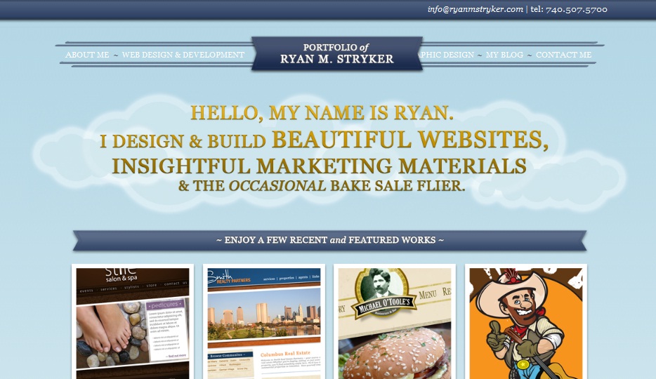
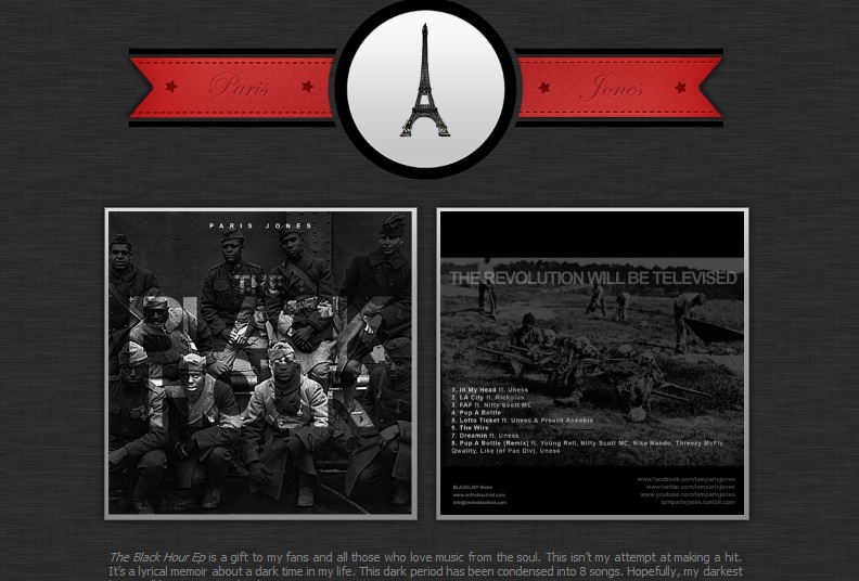
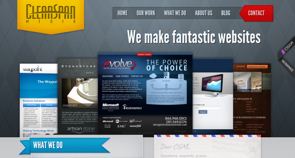
Ribbons and tags are by far the most discreet and silent of the web designer tools. When browsing various websites users do not often notice these applications within the websites, although if you look carefully you will realize that most websites have a common pattern. One of these shared traits is the use of ribbons and tags within the website’s design that attract the attention on certain points.
They are becoming increasingly common and some say even overused in websites. Tags and ribbons are often used together to focus on one main objective, attracting the users’ attention.

A ribbon perfectly describes what this is used for in websites as it is in fact shaped as a ribbon and helps emphasize a sentence or an area within the page. A tag, whose definition may be less obvious, is a label that is used at the top of website pages to mark an area on the screen.
Most of the websites that have adopted tags and ribbons are without doubt the best around as far as quality is concerned as they really do provide outstanding design options and attractive web pages.
Why are tags and ribbons so effective?
The first most obvious trait is that they draw the readers’ attention as they give the impression the page is a three dimensional area with a tangible background. This effect allows the text to come forward towards the reader who is subconsciously drawn to the content. Many tags are designed to have an impact, whether with the use of three dimensional effects or other appearances such as color or contrasting effects.

Most web designers place these ribbons and tags in important areas on the web page, to drive users’ attention towards these. When designing the website, keep in mind which are your priorities and then place the ribbons or tags near these. Often tags and ribbons work together towards the same end and should be placed next to important information. Ribbons, unlike tags can take on quite a few different forms and their shape can take on a form of an arrow pointing at a precise area in the web page.
Tags and ribbons can take on a fabric texture or natural element, a trait that greatly attracts users. Although these are only digital reproductions of organic materials or related elements, they add texture and life to the web design.

Ribbons lead the reader towards the top of the page, thus subtly inducing the user to start from the beginning of the article or page. This is important because users tend to browse quickly through the pages without really paying attention and more often than not will skip the first paragraph, which is the one that is meant to convince the reader to stay on that page. Ribbons are also an excellent way to bring web page headers to the forefront.
You will find that most quality websites use tags and ribbons for specific needs, while at the same time adding a unique visual effect that focuses the readers’ attention on what is important in the website. This means that users can browse through the website more effectively and will be satisfied by the content simply because they have been “guided” through it.
No related posts.
Related posts brought to you by Yet Another Related Posts Plugin.


Leave Your Response