People create new web pages on a daily basis. If you want to make sure that your designs stay ahead of the curve, you have to be sure to closely follow the latest trends in the design world. Printed media is starting to have a lot of influence over online designs these days. Many people think that newspapers and magazines are out dated, and possibly a waste of paper, but they can be great for inspiring ideas for online media.
Printed publications have been around for a very long time, so they have a great deal of experience. The greatest designs in the world are easy to understand, clear and powerful at the same time. Printed media follows the rule that negative space is crucial, and white spaces are used in abundance. Just take a look at a magazine, newspaper, or even billboard, and you will understand how they use negative space to great effect.
The internet does not necessarily use the same methods for design as the printed world does. Internet publications are not restricted in how many words they can use, as printed media is. There is a lot that graphics can be used for as well. Online media can also use things like audio, video and animations to get their point across. Being able to use these types of things inspires web designers to push the envelope as much as possible, where printed designers would be otherwise restricted.
The market for web pages is looking for a less cluttered look these days. People are looking for improved search engines, better website navigation and less distracting media such as animation and graphics. It seems that you cannot visit a website these days without being bombarded by scores of distractions.
All too often, the message that a site is trying to get across is lost in a sea of bells and whistles. This is why many designers are taking inspiration from traditional printed media, so that they can convey their message in a clear and concise manner.
Typography
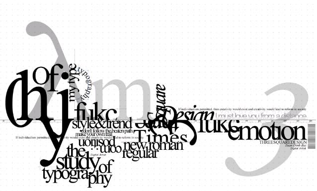
The art of typography seems to have been lost by many designers, who would rather use fancy graphics and videos than blocks of text. However, it is still important for a designer to have a sound understanding of typography, if they are going to make successful web pages. It is the art of communicating without using actual voice. Text might not be important to many people these days, but it is still one of the most effective ways to get a message across. Designers need to find the right balance of text and other mediums to properly communicate, without the use of overly complex website designs.
Layouts
In the early days of website design, the traditional rules of design were pretty much thrown out of the window. Tables and frames became popular, and designs started to become more and more complex as the internet evolved. These days people are going back to the designs of old, so that they can reach users without making things too complicated.
No related posts.
Related posts brought to you by Yet Another Related Posts Plugin.


Leave Your Response