There are marketing professionals, designers and strategists constantly working to churn out new designs, templates, and strategies. They use their experience, forecasting skills, and marketing trends and accordingly release new models. Despite all their efforts, sometimes the proposed model or design may utterly flop leaving the designers in complete despair. This happens quite often. Despite best designers having given their best efforts, failures do occur. There may be a number of reasons for that. A lot would have changed during the time the idea took to materialize in its final form. What is latest and desirable yesterday may become obsolete tomorrow and its never easy to know what will click with public and when. Often professionals can’t decide between choices and hence go with their instinct. But instincts cannot always be right.
The solution for this problem is testing. More and more professionals are taking to testing right during design process to check a service or product’s success level with the users. Testing in design process is really beneficial as changes can be made to deign as and when required.

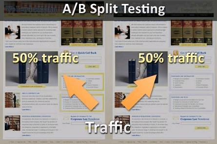
A common method of testing is A/B testing or split testing wherein two designs are pitted against each other to check which design works best. Testing is done simultaneously but with different set of users. The successful version is then implemented as part of companies marketing initiatives to maximize profits. This method ensures better user experience.
Various elements that can be compared are: Call to action text, size, wording and placement. Designs, layouts, templates, styles of website, captions, images on different pages, etc.
This process eases decision making process of designers and also measures conversions that involve clicks on links, product purchases and rate of returns on a site.
But each little thing cannot be tested. For example testing different sizes or colours of text is simply stupid and not feasible. Also, it is important to focus on one variable at a time to avoid ambiguous results. Designers can know where exactly they have gone wrong by proper implementation of this testing technique.
Examples: Requiring a fee to sign up or free sign-up
Requiring additional details to complete a profile
A/B testing is cheap to carry out and if you consider the losses that might occur due to result of bad designs then this technique is a great way to save your money. Also, cost effective compared to other techniques. Low risk is involved and availability of guaranteed proof makes it a great method. Test running new designs avoid many future complications.
No related posts.
Related posts brought to you by Yet Another Related Posts Plugin.


Leave Your Response