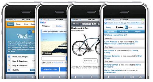
Nowadays many of us, especially those assiduous bloggers and tech-savvy professionals use mobile devices to browse the web pages, as well as other popular mobile devices that are hitting the industry at the moment.
This means that websites are now working more and more at optimizing their pages for mobile phones and devices, in view of the increasing demand. Although the demand is high, creating and optimizing your pages is no easy feat, and although there are advantages, considering the large number of mobile phone users, there are also many disadvantages when having to optimize web pages for mobile devices.
All elements considered the disadvantages probably outnumber the advantages when having to optimize pages for mobile devices and phones. Take the example of a mobile version of a website, which displays a screen that shows only the content of a post as does RSS reader. The advantages of using this optimization is that users will be able to read the latest articles posted fast and these will be easily accessible. The way you read the text is also easier and pages usually load rapidly.
The disadvantages are that it is more difficult to find posts that have been published at an earlier date, and all the visual and branding effects are not shown. Not all the parts of the web pages can be viewed, and these may include important parts of a website, such as subscription forms and other elements you need to make a purchase or view your account.
If your website is straightforward and adopts a minimalistic approach then many of the latest smart phones that come with good screen resolutions may be able to view your website pages in a decent way. This is another issue to consider, as while you are strenuously working on making your website mobile-friendly, these new devices are evolving everyday and all the work you may have put in to the creation of a website for mobile devices will become obsolete.
Some iPhone 4 users have absolutely no issues as far as page viewing goes, and can easily read the content on most websites. This means that while older versions of mobile devices could cause problems as far as website viewing was concerned, the earlier versions have greatly improved web browsing usability.
Nowadays with so many people using mobile devices to connect to the Internet, companies are making a big effort to produce devices with good screen resolutions, which enable users to browse through the Internet with limited difficulties. So does it make sense to optimize your website for mobile phones and devices when these are evolving towards browser optimization?
In the next few years there will be an increase in mobile device users and the way your website is optimized for these particular devices will no longer be an important issue. All the most popular companies such as iPhone and smart phones will surely be closing the gap between computer use and mobile use, so you will no longer need an optimized website for mobile devices.
No related posts.
Related posts brought to you by Yet Another Related Posts Plugin.


Leave Your Response