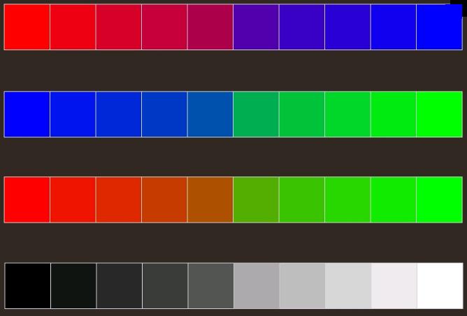
Color use on a website is fundamental and must really be carefully chosen in order to compliment and render your website exceptional. If you use the wrong colors in your web pages, you will surely lose a lot of readers and visitors will most likely go browsing elsewhere.
Although the design is a very important aspect in the entire creation of a website, content is what users will need to find out what the website is all about. If the text within the web pages is illegible, because the font you have chosen is unclear or the background does not offer enough contrast, your audience simply will not read what you wish to convey. Imagine trying to read white text on a pale blue background, or dark blue text on a dark green background. Although you may think it looks good, this will only frustrate your readers and will be defeating the object.
Here, are a few tips to help you choose the right color scheme and make your website exceptional to your readers’ eyes.
If you are uncertain on how to use colors in order to work with contrast and appealing color schemes, you can use a design program to help you achieve this goal. There are quite a few programs available, however, you can try colorlovers, which provides some professional advice about your own designs and also shows some examples that can inspire designing.
Colors play a fundamental role in how people react to different color schemes. The personality of a company can also be determined by the right choice of color, for it will represent what your company wishes to convey and will be recognized by your clients and potential customers.
The first element in a website is the logo. First design your logo and only then use the colors within the logo itself to set the theme for your web site. This has two main functions, the first to make your logo stand out and the second to create a consistency in the designing of your web pages.
Avoid using too many colors, stick to one main color and a contrasting background and use different shades of the same color. The important issue is to keep to your color palette, and play with the various shades of one color or two, as long as they complement each other.
The use of an analogical color scheme is what you should be aiming at. Choose one color as your basic theme and another one that will work to enhance the former. Then use these two to create a consistent and interesting web page, with contrasts that will work to focus on the text and steer the readers’ attention to the important elements on the web pages.
Keep away from those colors that are difficult to read, and keep in mind that the text is the key to your website, whether the design is exceptional or not. Readers will simply click away if they cannot read what it is you are promoting.
No related posts.
Related posts brought to you by Yet Another Related Posts Plugin.


Leave Your Response