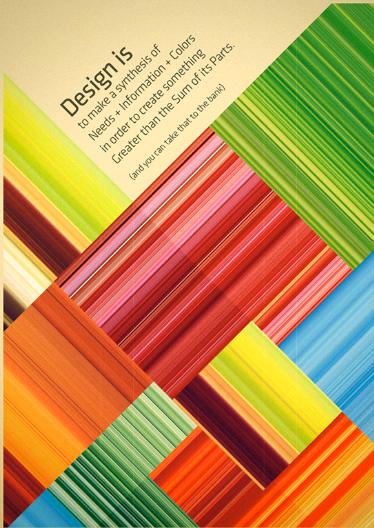
Nowadays there are many templates and programs that amateurs can use for designing business cards or letterheads, however, this will not have the same effect as a similar product designed by a professional. Most times these flyers and business cards have too many fonts and colors and are not eye-catching, but rather confusing.
Here are some tips to help those who are not graphic designers achieve a professional looking product that will get their promotional message out effectively, and understand the basics of graphic design.

The first rule to keep in mind is consistency. You should never use more than two different fonts on your product. Use one for the header and the other for your main text. You should use colors respecting a certain color range, such as pastels with pastels. If you are using images, these too should be consistent with the message and the color scheme.
Your message has to be repeated, if you want people to remember your product. People should be able to recognize your brand at first glance; this is because you have conveyed the same message repeatedly. Although you may not be an established company, you should start building your visual consistency in all products, such as business cards, brochures and any other promotional material you will be using.
When using colors, these too will have to be consistent and you will need to limit them to just a few. If you are designing business cards you will need fewer colors than for brochures, simply make sure these are proportional to your text and design. Always start with your logo and take a few of the colors from your logo and use them for your main design and text. To accentuate and contrast the text with the background, help yourself by using the color wheel and find out which colors contrast with each other.

When you are an amateur at graphic designing you should really keep it as simple as possible. Choose only a few simple elements that will look neat and clearly convey your message. When composing how the elements should fit in your space keep in mind that this should be a natural sequence for the eye. Composition of elements can be difficult, and there are a few simple rules to follow.
One rule is the thirds rule, claiming that the eye naturally divides an image into three parts. This means that you should focus the point you wish to come out on two thirds of your space. The eye will naturally follow lines that are presented to it. You need to have readers naturally following the whole image, without having to jump from one to the other.

A technique you can use, if you are not sure where to place your images and text on your product, is to print it out, then cut out the various elements and start to re-arrange them on a larger support. This will allow you to realize just how well they flow as you view them.
No related posts.
Related posts brought to you by Yet Another Related Posts Plugin.


Leave Your Response