Large corporations have a lot of money to throw around, so you would think their websites would reflect this. However, there are many big corporate sites out there, which do not give the user a good experience. If the user does not enjoy using a site they will simply click away to the competition.
Any user knows the function of a website is just as important as the visual aspects. However, making this clear to a large client might be difficult. Many larger companies simply want their sites to copy other popular designs, without worrying much about how easy their pages are to use. Even though these big corporations have a lot of money to throw around, they often settle for simple text based sites, which are not visually appealing at all. Whichever end of the spectrum you have been asked to design for, you should consider some of the following sites for inspiration.
Adidas
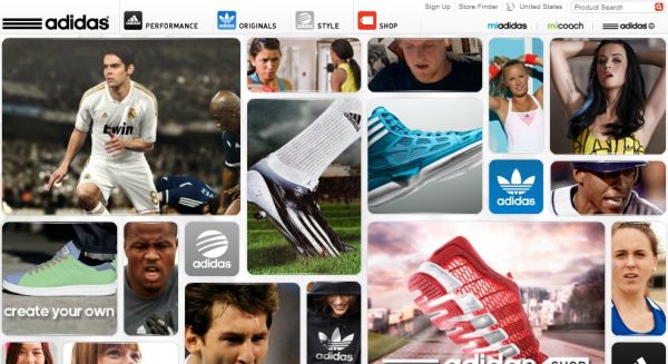
There are few sites, which use the grid design so well. There are separate modules, which can be expanded and contracted to allow for some truly dynamic exploration. This can be a great deal of fun, mainly because there are so many different areas to explore. The images do not accurately reflect what they open up to display. This means that the top menu is a very important aspect of this website.
Citreon
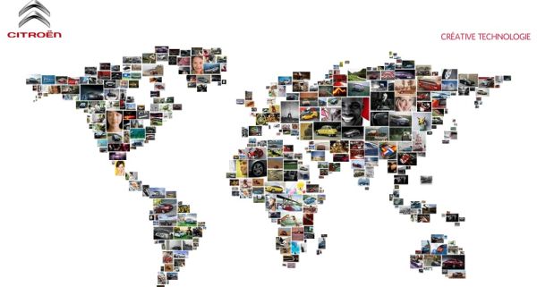
The old technique of gathering small images together to create a larger image has been done time and time again. However, the Citreon website does this very well, creating a new spin on the traditional method. As you move your cursor across the larger image, the smaller photos appear to dance around it. You can then select a section of the bigger picture. This is a great example for others who are creating landing pages.
Heinz
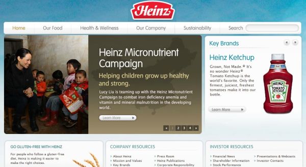
This is one of the best known brands in the world. Heinz has dedicated its website to the consumers of its products. There is a globe, which can be turned around by clicking on different photos, and then recipes are displayed. It does not matter what your skill level is, this website is suited to you. Heinz has discovered a new way to engage customers and bring them back for another visit.
Prologue films
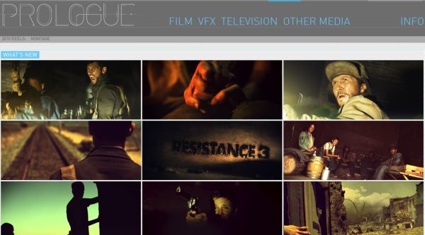
This company makes opening credits and special effects for movies, so you know that their website is going to be visually appealing. The site consists of a grid with a grey color scheme. The simple colors and focused design puts the customs designs and effects up front as the main focus.
Rolex
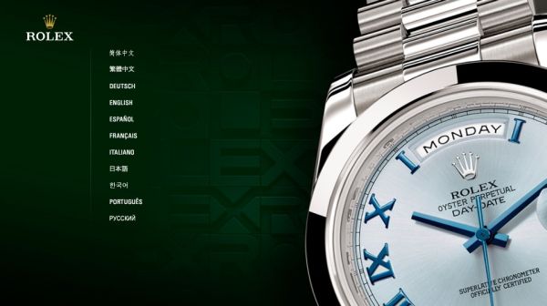
This site is unique because of its great attention to detail. The gorgeous products are displayed so well that you almost miss the clever effects, such as the clock face, which changes to suit your time zone. The design of this website really makes you realize that attractive design can be seamlessly blended with usability. Rolex has done well with their website design.
No related posts.
Related posts brought to you by Yet Another Related Posts Plugin.




Leave Your Response