One of the most essential elements of any website is the input form. This is the basic method of interaction between a consumer and the business. Many companies fail to realize the importance of the actual sign up form. There are a number of elements and techniques that can be used to make your input form more successful. Below are a few tips on adding some interest to your web form.
Quirkiness
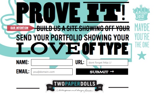
Your webform should represent the personality of your business. Making the form a bit friendly and fun can help you to make filling out the form more fun for the individual. Some great examples of quirky webform sites include Jarad Johnson, which is the shape of a postcard, Red Tiki ties in their logo to make the page fun, Applicom uses a letter form, and Two Paperdolls, although the form is busy, it works because the page is designed well.
Validate Clearly
It is important to note that users will not spend any extra time making sure that they have correctly filled out the form. While it may seem like validation forms make the site boring and detracts the user experience, this is not true if it is done correctly. Keep the validation clear and simple. It should be used as a guide for the user, offering alerts only where necessary.
It is important to have the problem clearly marked so the user understand exactly what is wrong. Generic error alerts simply frustrate the user and are useless. If a problem is plainly pointed out, most people will happily fix it and move on.
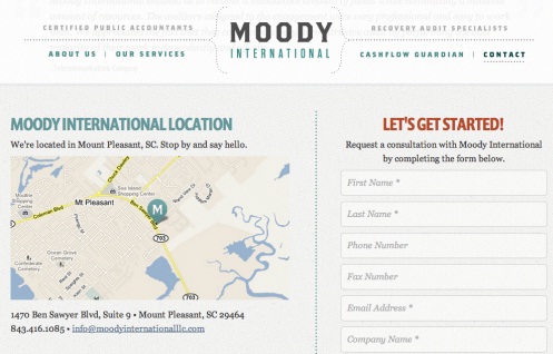
Moody International offers a good example of a site that offers a form that is a great combination of different information needed all in one place. The site does not offer instant validation, but rather uses popups to inform the user of mistakes.

Orlando Advertising has a very attractive web form. Unfortunately, errors are only noted after a user has hit the submit button.
GitHub has a very simple sign up page and is extremely functional. One of the aspects of the page is the fact that it recognizes the credit card brand and highlights it on the form to give the user instant feedback.
Interactivity
The input form is the most interactive part of a website and people generally want elements that feel alive and are conventional to interact with. Using different effects such as 3-D or box outlines are a great way to give simple reaction to user input.
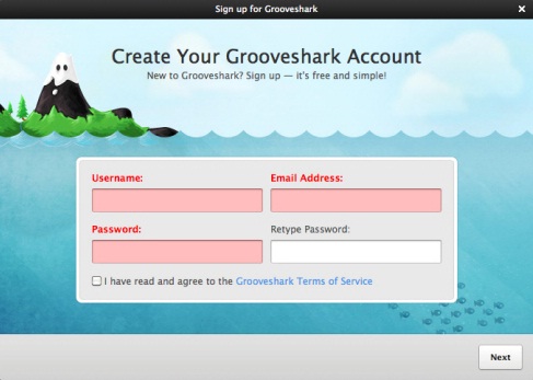
Grooveshark VIP makes it very clear, which boxes are being interacted with by the user. The design is great at helping the user maintain focus and fill out the form quickly and easily.

Unlocking uses a simple form, but has a high level of responsiveness. This makes the page easy to use and allows an individual the ability to know, which field they are working on at every point in the process.
Finishing
The goal of an effective sign up page is to get the consumer to finish the page and purchase the product or sign up for your services. If your page is not user friendly, chances are high that they will stop filling it out and go on to something else.
Using these tips and samples, you should be able to make your sign up page as inviting as the page that brought the potential consumer to it. After all, we spend all this time getting them to the page; we do not want to lose them at the end.
No related posts.
Related posts brought to you by Yet Another Related Posts Plugin.


Leave Your Response